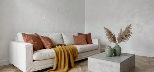
White and gray form a neutral chromatic base used in most contemporary interiors. Their main strength is also their limitation: without accompanying color, the room can turn flat, even cold and clinical. Choosing the colors to pair with white and gray is about deciding the temperament of a room, not just its palette.
Warm white or cool white: the choice that conditions all associations
Before considering an accent color, you need to qualify the white already present in the room. A creamy off-white (vanilla, cashmere) does not accept the same companions as a pure optical white.
A warm white leans towards pale yellow. It naturally pairs with earthy tones: terracotta, ochre, powder pink. Conversely, a cool white, slightly bluish, highlights duck blue, sage green, or deep anthracite gray.
The same logic applies to gray. Recent color charts favor slightly taupe or beige grays that warm the base without yellowing it, an alternative to purely bluish grays deemed too sterile for living spaces. Identifying the temperature of your neutrals is the technical prerequisite for any color decision. To delve deeper into the topic, check out this guide on colors to pair with white and gray.
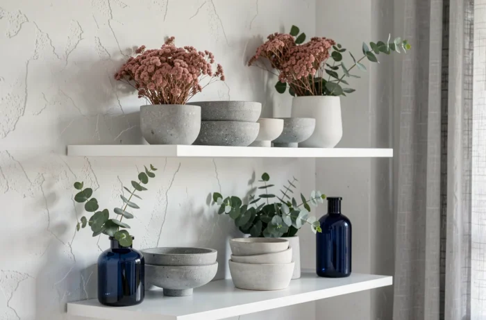
Accent colors for a white and gray living room: three reliable directions
The living room is the space where the white-gray duo is most common, and where adding an accent color produces the most visible effect. Three families of shades work according to different logics.
Warm shades: powder pink, terracotta, ochre
Powder pink softens a pearl gray without feminizing it excessively. It works on cushions, an accent chair, or a limited wall section. Terracotta and ochre bring an earthy depth that grounds an overly airy living room.
Just one wall in a warm shade is enough to transform the atmosphere of an entirely gray and white space. Multiplying colored surfaces cancels out the desired contrast effect.
Cool shades: duck blue, sage green, navy blue
Duck blue remains a safe bet with medium gray. Sage green, more discreet, suits interiors seeking a natural ambiance without resorting to solid wood everywhere. Navy blue, on the other hand, creates a more pronounced contrast, suitable for large volumes.
Black and dark materials
Black is not a classic accent color but a graphic element. Black light fixtures, a dark photo frame, or a black metal coffee table structure a white and gray living room by adding visual tension. It is the most understated option for those who refuse bold color.
Gray and white bedroom: balancing color without disrupting rest
In a bedroom, the logic changes. The goal is no longer to energize a social space but to maintain an atmosphere conducive to sleep. Saturated colors should be limited to textiles and small objects.
- Old rose or light mauve on bed linen creates a point of softness without exciting the eye, compatible with pearl gray walls.
- Golden beige, in curtains or a tufted headboard, warms a white bedroom without adding strong contrast.
- Very desaturated olive green, on a cushion or throw, introduces an organic note that breaks the monotony of gray without disturbing sleep.
Limiting the accent color to two textile elements in a gray and white bedroom avoids a catalog effect while maintaining visual coherence.

Common mistakes when pairing colors with white and gray
The first mistake is to ignore lighting. A shade that appears soft in natural light can become garish under cold white LED lighting. Testing a paint sample on the relevant wall at different times of the day remains the most reliable method.
The second concerns the multiplication of accent colors. Beyond two accompanying shades, the neutral base loses its unifying role. A white and gray interior with both duck blue and terracotta can work, but only if one clearly dominates the other.
The third trap: neglecting finishes. A matte gray on the walls and a satin white on the woodwork do not produce the same effect as a satin gray everywhere. The difference in finish creates a subtle contrast that can render an accent color unnecessary or, conversely, make it essential.
White, gray, and property value: a heritage choice
Interior designers cited in recent decor press emphasize that sophisticated neutral palettes (precise warm whites, subtle grays) are associated with a measurable increase in resale value of the property, particularly in kitchens and living areas. Kitchens with well-chosen dark grays would be accompanied by a notable increase in estimated value compared to very bright shades or overly cold whites.
This observation does not mean that all color should be banned for resale. It confirms that a white-gray base, when well calibrated in temperature and finish, constitutes a decorative foundation that reassures potential buyers. Accent colors, on the other hand, remain easy to modify before a sale.
The white and gray duo is not an end in itself but a framework. Its quality depends less on the added color than on the coherence between the temperature of the neutrals, the lighting of the room, and the dosage of colored surfaces. A single well-chosen cushion can do more than an entire mismatched wall.